BLOG

Pantone

color palette

What A Style Guide Can Do For Your Brand

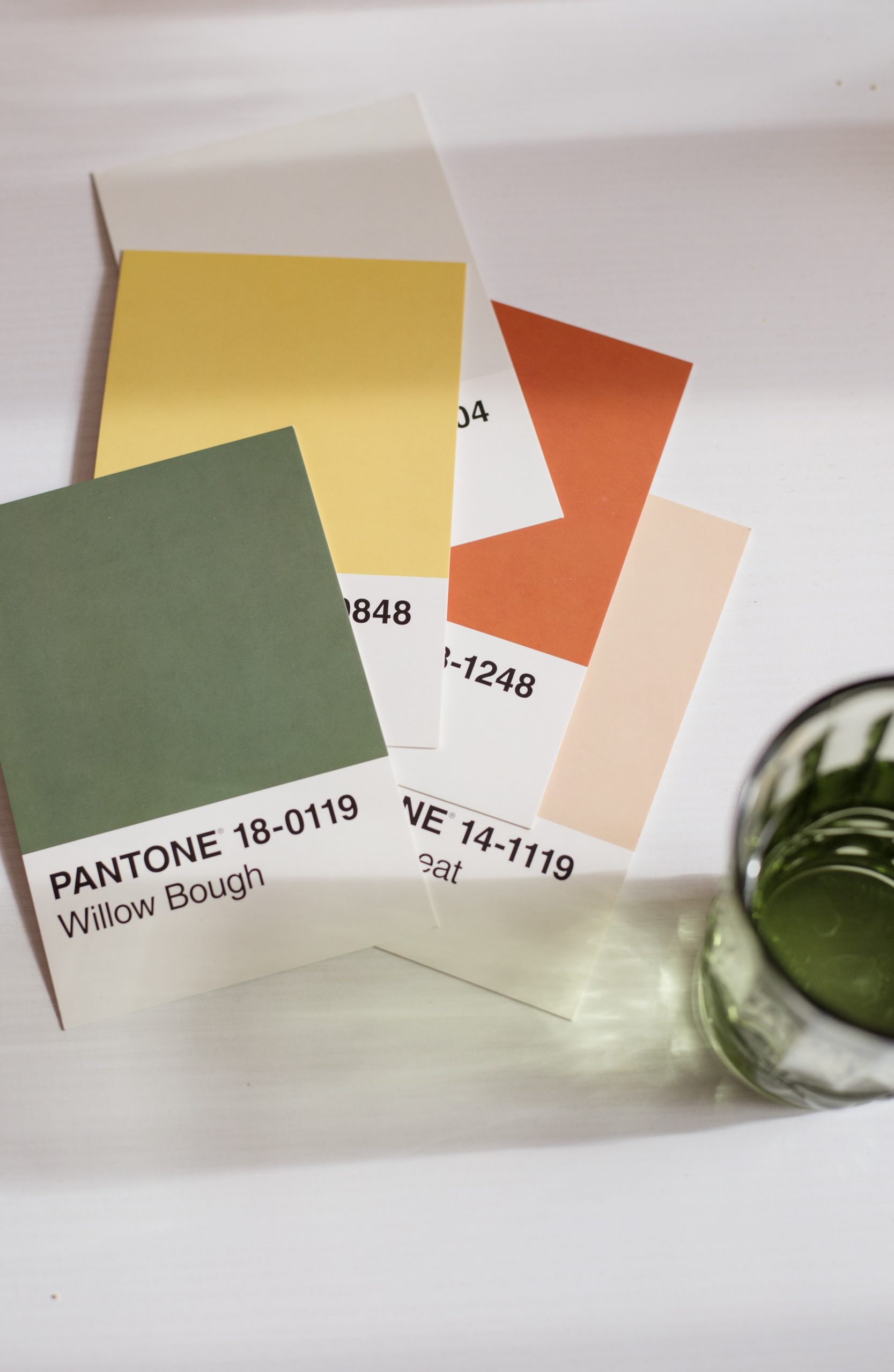
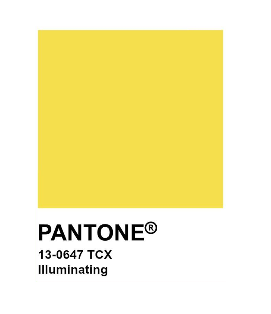
Pantone is a North American corporation that created the Pantone Matching System (PMS) which is a system that allows identifying colors for printing by means of a specific code, a system for color matching. Pantone color charts, also known as “Pantone guides”, are a standard in Graphic Arts when it comes to color communication. In the world of design, these guides allow us, regardless of the operating system we use, monitor or screen, taking into account that the latter show the color in RGB mode, that the output color in printing is correct, either in Plotter or in Offset or digital offset, which allows us to always see the same McDonald’s yellow or Coca-Cola red (in CMYK).
How should we use it?

Each computer screen or monitor is different, printers are also different, which is why PANTONE colors have been created.
These are codes to identify colors in order to facilitate communication and prevent mistakes from being made. So that when we say to our printer: “I want to print in blue color 14-4122”, we are absolutely sure that the result will be what we want. Or when our clients ask us “the background is yellow” we can show them the PANTONE colors so that they can choose the exact tone in which they are thinking and in this way facilitate the design process and customer satisfaction.

Want to be Distinta?
Let's Talk.

Here is your reminder to just start that idea that you have been thinking about!

To build a successful business, you must start small and dream big.