FEATURED STORIES
The Anatomy of Typography: Crafting a Unique Brand Identity
In the world of design, typography is more than just choosing fonts; it’s the language your brand speaks before any words are read. Each letter, space, and curve becomes a piece of your brand’s story. For those of you looking to craft something truly distinct, understanding the anatomy of typography is key to designing a brand that stands out and speaks volumes—without saying a word.At Distinta Brand, we believe that every element in design should carry meaning, and typography is no exception. Let’s break down its core elements and show you how they can shape the identity of your brand.
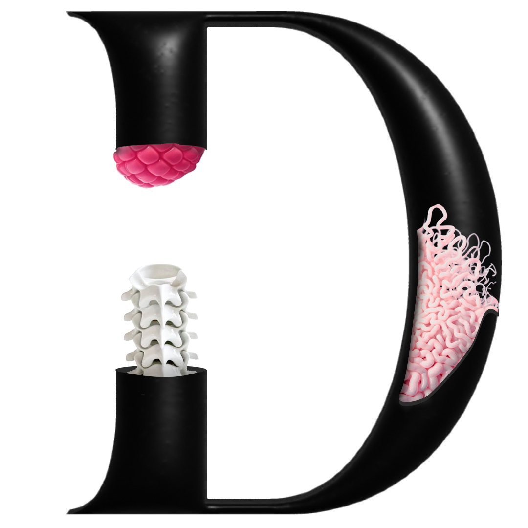
1. The Spine of Every Letter: The Backbone
Think of the backbone, or spine, as the soul of the letter. It’s the central curve that gives letters like ‘S’ and ‘Z’ their distinctive shapes. A strong, well-defined spine suggests stability and reliability—perfect for a brand that embodies strength and trust. On the other hand, a playful or flexible spine can give off a more approachable, dynamic vibe.
1. Recognition and Differentiation
In a crowded marketplace, a strong brand serves as a beacon of recognition. It’s the reason why you can spot a Starbucks from a mile away or identify a can of Pepsi amidst a sea of beverages. A well-crafted brand sets you apart from the competition, allowing consumers to make informed decisions in seconds. It’s the first step in building a relationship with your audience.
2. Serifs: The Flourishes of Character
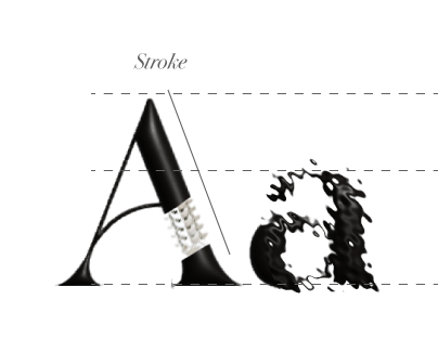
Serifs are the small lines or strokes attached to the end of larger strokes in a letter. Brands that use serif fonts often convey a sense of tradition, sophistication, and trust. Think about high-end fashion houses or luxury goods—they often lean on serif fonts to communicate elegance and timeless appeal. If you’re aiming for a more modern, clean, and minimalist approach, consider sans-serif fonts, which skip the flourishes for a streamlined, direct look.
3. The X-Height: The Measure of Legibility
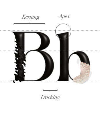
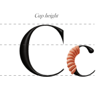
The x-height is the height of a lowercase ‘x’ in any typeface, and it dramatically impacts readability. A larger x-height makes your text easier to read, making it perfect for digital platforms. But for brands looking for exclusivity or an artistic touch, a typeface with a lower x-height can add an element of mystery and sophistication.
4. Ascenders and Descenders: Adding Personality
Ascenders are the parts of letters that extend above the x-height (think of the top of ‘h’ or ‘l’), while descenders dip below the baseline (like ‘g’ or ‘y’). These strokes add flair and height to your typography. For brands seeking to be noticed, a typeface with bold ascenders or sweeping descenders can draw the eye and make a statement. It’s like adding an extra note to your brand’s melody.
5. Kerning: The Space Between
The magic often lies in the details, and kerning—the space between letters—is one of the finest details that can make or break your design. Tight kerning might communicate urgency, while more spacious kerning can give a feeling of luxury and breathability. The rhythm of your typography sets the tone for your brand: Will it be fast-paced and direct, or calm and expansive?
6. Alignment: Setting the Tone
Alignment is like the stage where your typography performs. Left-aligned text feels natural and easy to read, which is why it’s often the choice for long-form content. But if your brand wants to take a more creative or avant-garde approach, consider center or right alignment to give your design a modern edge.
